P&G's Research and Development team is beta testing a potential new product, a smart scent dispenser with wifi, LED light, and sensors. They're looking to gauge the value of this type of hardware with their core Febreze consumers.
The team aims to create a user-friendly app showcasing the hardware's key features in time for their CES launch.
The project's success hinges on helping P&G confidently decide whether to invest in connected devices in this space. Pre-order rates will be the primary metric used to assess this.

My team and I are tasked with designing and developing the app that will be used to control this prototype hardware.

The existing customer base are loyal to Febreze plug-ins that dispenses scent at a fixed rate. This hardware works with the same cartridges.
I worked closely with P&G's research team, leveraging their expertise and customer knowledge to gain a deep understanding of the problems this product aims to solve.

In this version, I explored a more traditional dashboard layout. I made an assumption that this consumer base would appreciate a more familiar paradigm. I also played around with showing incremental numbers for the scent control.

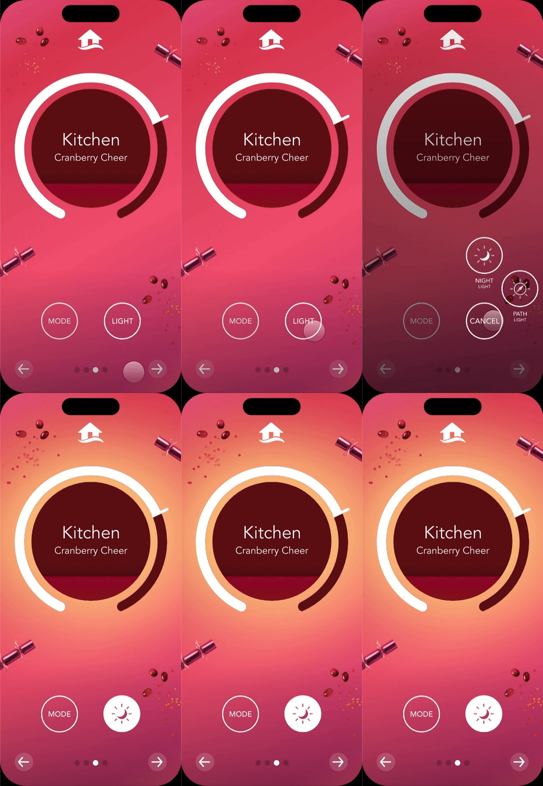
Since the client is hoping to use this app to generate buzz for their pre-orders, I wanted to push the boundaries of what the experience could feel like while keeping ease of use in mind. This version keeps the layout minimal and allows the user to focus on one room and one scent at a time. I also played with some concepts that would allow scent to be quickly dialed up or down.

The core experience focuses on the scents and scent control. I designed the UI using a modular approach that allowed for easy customization without sacrificing code reusability. This approach ensured a visually rich and engaging user experience that remained scalable across the scents.

While the device offered advanced features like temperature and humidity sensing, we prioritized the core user experience of scent control. By presenting this supplementary information in a distinct global view, we achieved a balanced approach that catered to both user needs and the client's desire to showcase the device's full potential.

I leverage elegant animations and transitions to create a unique experience for this app. Given the tight development timeframe, I created prototypes to help communicate and discuss my ideas with the team to ensure the solutions are feasible for our delivery date.

I made a conscious effort to avoid overwhelming users with excessive text and labels. Instead, I leveraged universally understood icons and visual cues to represent the various states of the device. This design choice not only contributes to a cleaner aesthetic but also enhances usability by providing status information at a glance.


